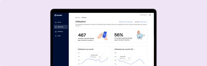
The ‘Utilisation’ Dashboard visually represents the volume of unique members within your organisation who are actively using the Sonder App over a defined period. We identify an active user when they have one or more sessions within the reporting period that include successful logins and engagement with key app capabilities. This ensures that the data reflects genuine interaction, not just a casual glance.
Why is App Usage Data Important?
Analysing app usage data is paramount for any organisation committed to supporting the well-being of their people. Here's how this information empowers you:
Identifying Trends: By observing usage patterns, you can spot emerging trends in member needs. For example, a sudden increase in app usage might indicate a period of high organisational pressure, allowing you to proactively address the underlying causes.
Revealing Potential Issues: Low utilisation in specific divisions/business units or during certain periods could signal a lack of awareness, accessibility issues, or other barriers preventing members from accessing support. This allows you to investigate and implement targeted solutions.
Demonstrating ROI: The dashboard provides concrete data on engagement, allowing you to demonstrate the value and impact of your investment in member well-being initiatives to stakeholders.
Chart Summary
Utilisation by month

This chart offers a 12-month historical view of the unique members who have used the Sonder App each month.
|
🤔 How this is useful This trendline allows you to see long-term engagement patterns, identify seasonal fluctuations, or track the impact of internal campaigns aimed at promoting Sonder App usage. |
Utilisation by month (%)

This chart presents the percentage of active members with access to the Sonder service who have used the Sonder App in a given month.
|
🤔 How this is useful This percentage provides a clear benchmark for overall utilisation. It helps you understand the penetration of the Sonder service within your activated member base and highlights opportunities to increase overall adoption. A low percentage might indicate a need for more internal promotion or awareness campaigns about the benefits of the app. |
Division utilisation by quarter (%)

This table breaks down App Utilisation by your organisation's defined business units or departments.
|
🤔 How this is useful This granular view allows you to identify which divisions are actively leveraging the Sonder App and which may require additional support or tailored communication. |
It can help pinpoint specific teams or departments that might be experiencing higher levels of stress or challenges, guiding targeted interventions or wellness initiatives. The division values displayed here are set when your members are initially provided with access to the Sonder service. If you need to review or update these Division values, you can easily do so through the Members section of the platform, either by editing individual members or by updating member information in bulk.